Note: This post is part of the Color Conversations series. In the series, we post an article pertaining to color. Then we hold a webinar related to the topic. The next webinar will be held at noon CST on Wednesday, June 24. We will also have a special guest panelist for this webinar: Tony Morella of Digital Editions Atelier, a digital print shop for fine art printing. Click here to register.
It’s a decades-long frustration for graphic designers, photographers and printers alike. They all have the same goal. The result they want is a print with the best quality and accurate color representation. So why can’t graphic designers, photographers and printers agree on a color workspace that will produce the best print?
What is a color workspace?
Anyone who works with color management is familiar with ICC profiles. They are what characterize the color workspaces in which we choose to work. A color workspace is a scale that helps us to define color relative to the way humans see RGB color values. Using a specific color workspace, we can predict how the color of an image will turn out when displayed in its final format.
The two standard color workspaces used by most graphic designers, photographers and printers are sRGB and Adobe RGB.
 sRGB vs. Adobe RGB
In 1996, HP and Microsoft created the sRGB color workspace as a standard for monitors, printing and the internet. sRGB was built with the lighter working environments of offices and homes.
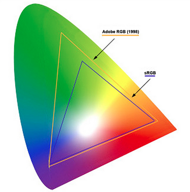
The gamut of the sRGB color workspace is smaller and tighter than Adobe RGB, as can be seen in the image to the right. While the mathematics and science behind the gamut is complicated, a tighter color workspace means that the transition between colors within the image will be smoother. However, a tighter workspace also means a decrease in the number of colors available.
Two years later in 1998, Adobe Systems Inc. (which owns the Adobe Creative Suite products such as Photoshop, Illustrator and InDesign) created the Adobe RGB color workspace. The goal of this color workspace was to achieve accurate color in images output on CMYK printers by using the RGB primary colors (red, green and blue) on a computer monitor.
 As seen in the image, Adobe RGB has a larger gamut than sRGB. While a broader gamut may mean coarser color transitions within a printed image, its advantage over the smaller sRGB gamut is the increase in colors available in the workspace. Adobe RGB is believed to include about 50 percent of all visible colors and is viewed as an improvement in color reproduction over sRGB; especially in the green and blue hues.
So which color workspace should you use?
As with most discussions when it comes to color management, there is no hard and fast answer for whether you should use the sRGB or Adobe RGB color workspace. Each image needs to be examined based on a few determining factors. Below are some examples.
 Use sRGB if the final image:
- Will be used online.
- Is being printed in a photo lab. (Most photo lab equipment works in sRGB.)
Use Adobe RGB if the final image:
- Is being printed on a color inkjet printer with a good color management workflow.
- Has colors outside the sRGB gamut. (If the image has a lot of green and blue hues, it might be best to use the Adobe RGB color workspace.)
There will be more during the webinar!
There is much more to discuss about sRGB and Adobe RGB. Join us on Wednesday, June 24, at noon CST by registering today.
Besides what we touched on in this blog post, we will also discuss some related topics such as:
- What color workspace should photographers use? What are some best practices? (With input from special guest Tony Morella of Digital Editions Atelier, a digital print shop for fine art printing.)
- What color workspace is best for printers and color management technicians? What do they prefer overall and why?
- What color workspace should graphic designers use? (With brief tutorial on how to set up, use and convert color workspaces with the popular image editing software Adobe Photoshop.)
Leave a Reply