Recently, we sent out an email newsletter and opened up a Q&A with our community. We invited them to send us some color questions and we were happily surprised at the number of responses we received.
While we can’t answer every question, we chose ones that we thought would help our community the most. We hope you find the topics interesting and invite you to contact us with questions of your own.
Topic 1: Color Trends
“I do original designs and (am) always interested in the color trends for each year.”
Submitted by Brenda
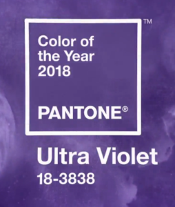 Our thoughts: Whether we like to admit it or not, Pantone’s Color of the Year usually spearheads the color trends for each year. The Color of the Year for 2018 is Ultra Violet (18-3838). The color is supposed to inspire inventiveness and imagination.
The Color of the Year reigns throughout not just the print industry; but also other industries such as fashion and home design.
However, that doesn’t mean it’s the only trend out there. Research has shown that we will also see bright and bold palettes as well as more gradients and metallics used as neutrals in design work.
You can also sign up for Color Marketing Group’s Color Alerts. We’ve found this to be a great resource for staying up to date on color trends.
“The Pantone Color of the Year has come to mean so much more than ‘what’s trending’ in the world of design; it’s truly a reflection of what’s needed in our world today.” – Laurie Pressman, Vice President of the Pantone Color Institute
Topic 2: Pre-Production Color Management
“We provide our custom ICC profiles and soft proofing settings to some of our customers, but many of them are not working with professional design software, or aren’t operating with employees who know how to implement color management on the front end before they send their artwork to us, the fabricator. What is your best recommendation for maximizing our workflow here when passing along color management information that would streamline our color-matching process on the front end is just not always an option?”
Submitted by Kelly
Our thoughts: It’s hard to comment on specific workflows when we aren’t familiar with them. We’d be interested to know how artwork is being provided when not using “professional design software.”
In any case, it’s important to know that you don’t need to be a color management expert to implement a few settings and processes into your workflow to increase your overall color quality.
For instance, most design software has the ability to edit color management settings. We suggest setting your workspace at Adobe 1998 for RGB and Gracol 2006 for CMYK. These settings allow you to work inside a larger color gamut. It’s important to make these settings the same within your RIP too.
Topic 3: Color Matching Between Printers
“We have two Mimaki JFX200 and one Xtran from Ink Cups Now. Now all three printers are printing different colors on (the) same substrate. Mimaki comes with RasterLink 6 and Xtran is using ColorPrint. Our goal is to make them print (the) same color. Can you please let me know your suggestion?”
Submitted by Fiona
Our thoughts: The reality is that this is exactly what we tackle in our consulting and training programs. There is no magic button or easy standard answer for this common problem.
One solution is to build a custom ICC profile for each of the printers using the process defined in the Color Management Pyramid. By doing so, you can achieve consistent, repeatable, predictable color for a common visual appearance between the printers.
What’s Your Color Question?
Send us your questions and we will do our best to answer them in next month’s Color Q&A blog post!
Want To Learn More About Color Management?
We have many training opportunities scheduled in different locations throughout the year. For the beginners, we have color management fundamentals workshops. For those who want to dive deeper, consider attending one of our Color Management Boot Camps where you will have the opportunity to become a Certified Digital Color Professional through SGIA!
Leave a Reply